

The Perylene family is relatively new to the exclusive pigment neighbourhood. The first Perylene was discovered in 1912 but didn’t move in until the 1950’s. Even then, it was not widely seen and only became part of the artist community in the 1980’s. Even today, their position is not as prominent as other families, such as the Cadmiums or Quinacridones. I suppose this is because of their shyness. They are beautiful, but not as heavily dense as the Cadmium (also considerably less dodgy) and not as showy as the Quinacridones.
- Perylene Green (PBk31)
I thought we might as well get rid of this one from the start. Perylene “green” is not a green but a black pigment with a green hue. Like most black pigments it is obtained by combustion, in this case burning a derivative of perylenetetracarboxylic, i.e. another Perylene. This is a bit of a mouthful and just means that like most blacks, it is made by burning some substance. As a result, the pigment is rather dusty and in my opinion not ideal for watercolour, even less for botanical painting. Shadows painted with Perylene Green will look flat and dirty, which doesn’t help with the difficult task of rendering the bright colours of fresh blooms.
- Perylene Scarlet (PR149)
Only Daniel Smith currently offers Perylene Scarlet. It is not part of my palette because its lightfastness is not as good as the other Perylenes’. It doesn’t seem to me like an irreplaceable colour and therefore not worth taking the risk of using a potentially fading paint.
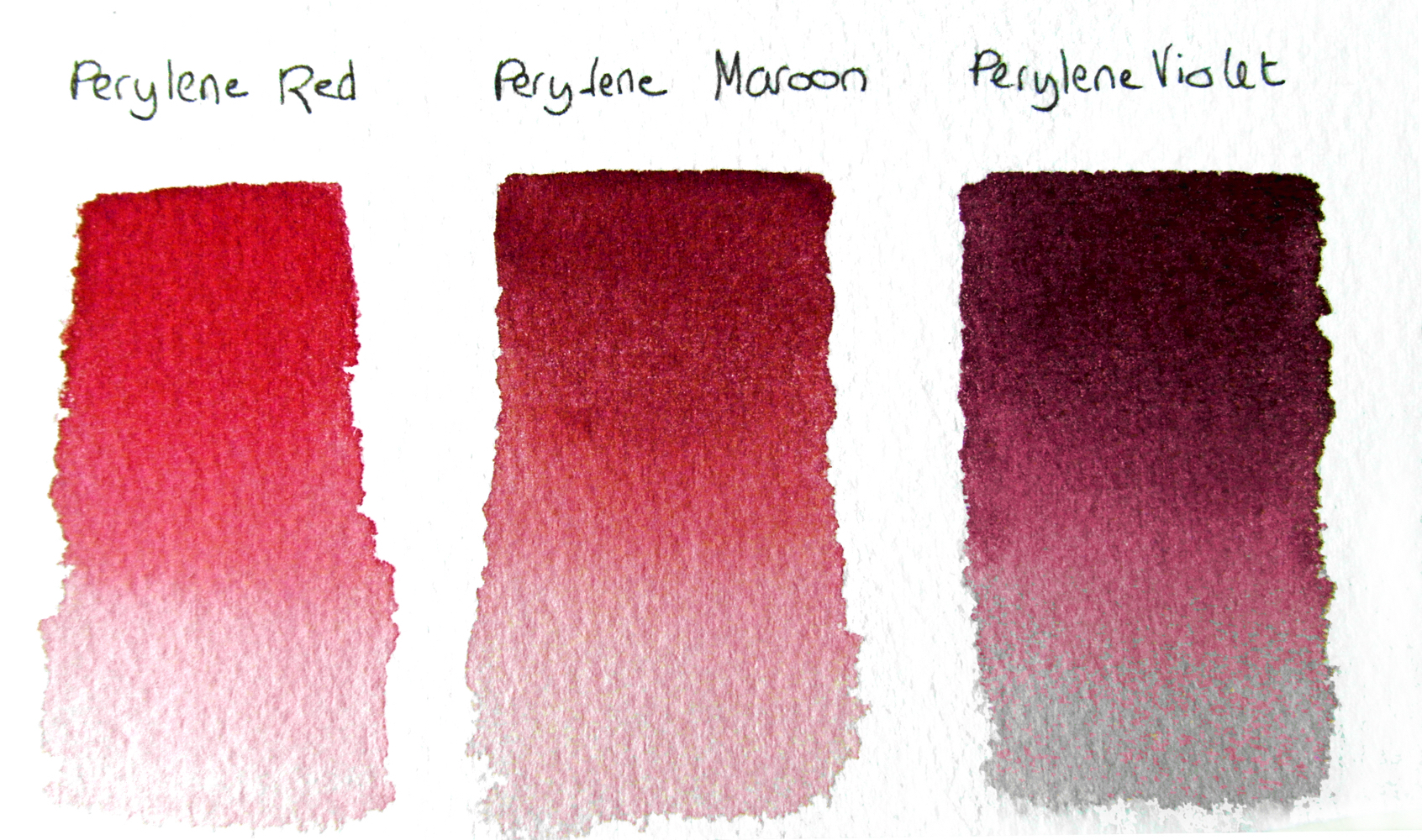
- Perylene Red (PR178)
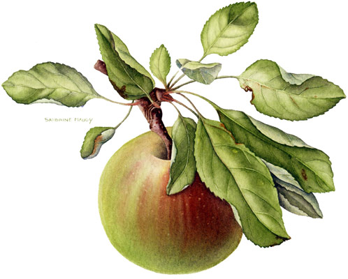
A dullish red with pink undertones, this is a good pigment that I do not use often. This is probably because I am not that attracted to red flowers, unless they have the deep crimson velvety texture of the most dramatic, heavily scented roses. However, I do use Perylene Red for fruit. Stripes on apples, blush on pears, leathery pomegranate skins, or any fruit for which a more common red would be too bright.
I use Daniel Smith Perylene Red. Daler-Rowney also offers a good version in their range. (Click on the colours for links to both on the Jackson’s website.)
- Perylene Maroon (PR179)
This red maroon is even duller than Perylene red, but again, being a reliable pigment, it does have its uses. I don’t think that I would plant any flowers of that colour in my garden. However, I find it useful for the same kind of circumstances as Perylene Red, when the markings on the fruit are less pink red and more brick red. I also use it quite a lot for foliage, especially in autumn. I am actually looking at some rose foliage right now that has this exact red shade in the young shoots.
In my palette I have the Daler-Rowney version. It is also offered by Winsor & Newton and Daniel Smith.
- Perylene Violet (PV29)
A rich purple maroon, perfect for hellebores, orchids and all black flowers like tulips and violas, it is also excellent to render the deep velvety texture of the dark roses mentioned above, such as ‘Deep secret’ and ‘Souvenir du Dr Jamain’.
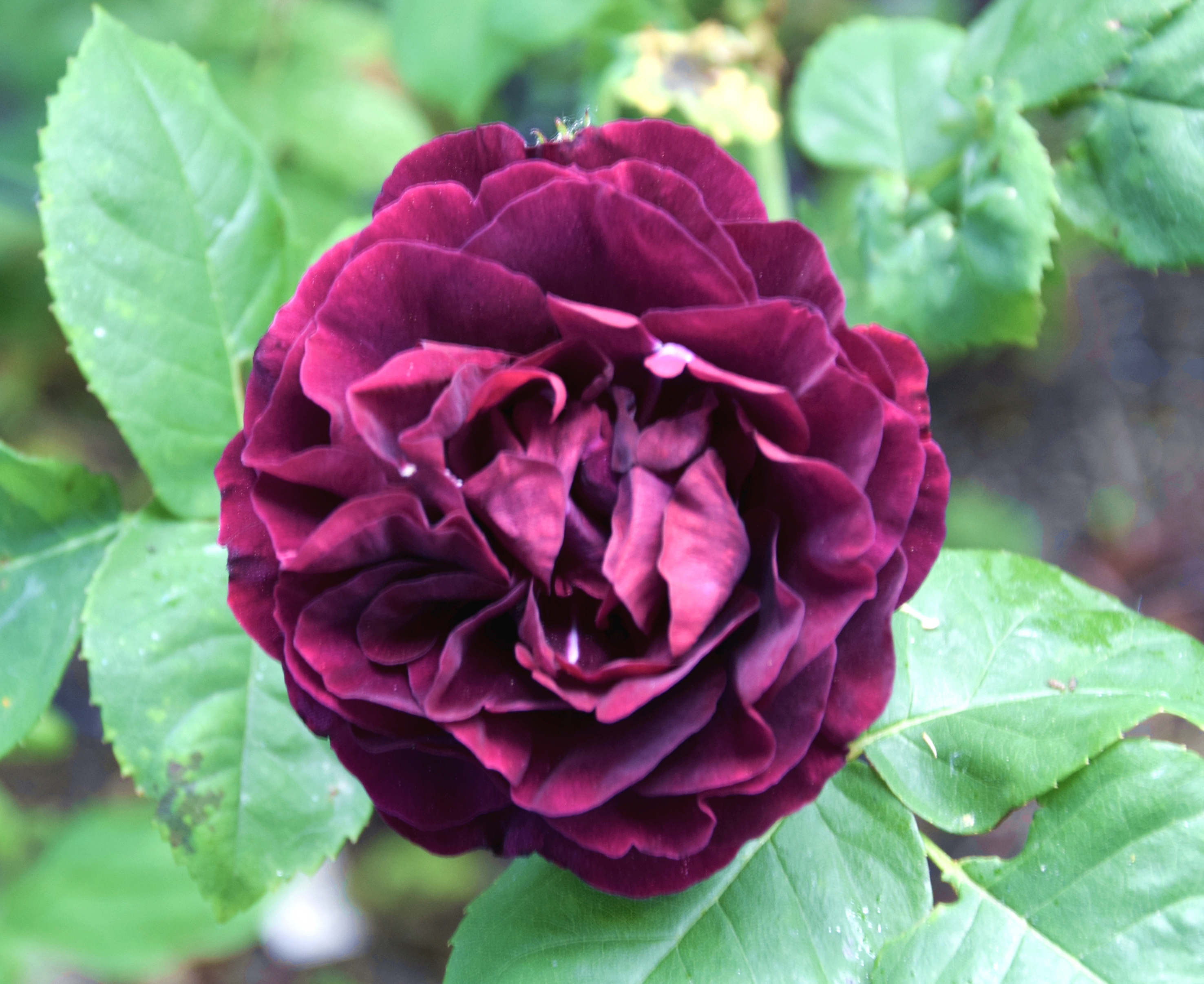
Perylene Violet is the most versatile paint in my palette. I do not understand how watercolourists can live without it. It might even be difficult to find one of my paintings in which I haven’t used it. I can hear the chuckles of those amongst you who have been to my classes and who know that I use it in almost everything. It has even been suggested by the cheekiest that I pick my subjects specifically to allow me to use Perylene Violet. But I’m not sure… sitting in the garden now I can see it in so many plants: the foliages of a rose and a serious-looking Penstemon, a few Aquilegia blooms, a lingering dark red rose, some self-seeded all-invading cheeky-beyond-measure Erigeron, the stems of the ‘Zorro’ Hydrangea, the whole of the imposing Malus ‘Royalty’, the spectacular bark of the Prunus ‘Serrula’, the wood of the quince tree, the stalks of the honeysuckles and the Cyclamen, the tiny barely-existing-yet apples on the Malus ‘Blue Moon’ and of course ‘Souvenir du Dr Jamain’, just about to open fully… the list goes on but I wouldn’t want you to nod off…
Here is a link to my favourite Perylene on the Jackson’s website.
Verdict on the Perylene family (measured in watercolour splashes):
This is a difficult one because the family is definitely split in two factions who are not on speaking terms. The Perylene Black and Perylene Scarlet I would forget about. The black is banned from my palette and the scarlet not reputable enough. So I will actually forget about them and pass a verdict on the remaining three, Perylene Red, Maroon and Violet.
Useful range of colours 5/5
Sufficient lightfastness ratings 5/5
Level of saturation 3/5
Irreplaceability 5/5
Total: 18/20 watercolour splashes

Thank .you for this 🙂 I keep seeing these colors but had no clue what they were . Sounds like I need to start saving for the violet 🙂
LikeLiked by 1 person
Yes, the Violet is the most useful one 🙂
LikeLike