While the rules of composition apply to card design, composition and design are two different things.
When composing a painting, the artist has to take into account depth and perspective, the mood they want to convey, the size and orientation of the picture as well as the mount’s placement. If illustrating for a book, practical issues come into play as well, with the format and space allocated to illustrations.
Designing for a card has one principal element: impact. The space on a greeting card is limited and the painting has to have maximum impact in this reduced space. The priorities change: perhaps depth and shadows are less important than striking colours, and realistic depictions can give way to slightly looser, more eye-catching pictures.
Composing a painting looks at the real subject and draws directly from it, in whatever style you choose. Design takes you one further step away from your subject.
Here are a few things to have in mind while designing a Christmas card:
- Composition rules
I will write a different post on composition so I will not go into the rules in great detail here. The same applies for a painting and for a card: the movement of the composition needs to lead the eye around the picture and special care should be taken with negative shapes. The composition should be balanced, in shapes and in colours.
- Scale
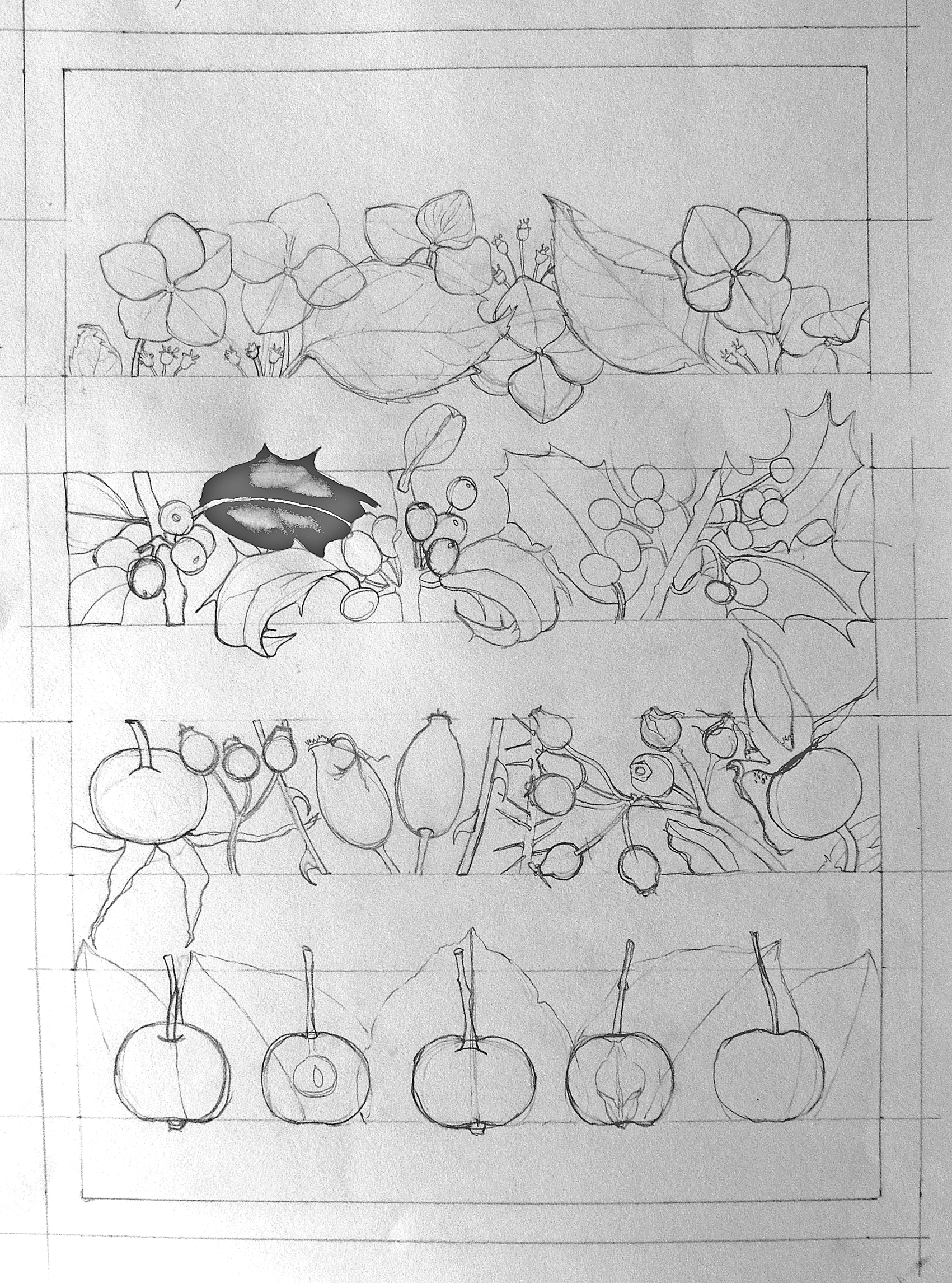
The first thing to work out with a design is the shape of the finished picture. For example, if the card is 10 x 10 cm, the original painting has to be 10 x 10 cm as well, or in scale with the card so that it can be reduced to 10 x 10cm. The details on a reduced painting will look impressive but by reducing too much there is a risk of losing them and thus lessening impact. I would not recommend designing a smaller painting and enlarge it for a card, as the details and edges would look scruffy.
- Edges
The decision on how to treat the edges needs to be taken early in the design process. The painting needs to sit well within the edges or it has to overlap the edges enough to print without leaving a white space around the design. This is called the “bleed” and if not considered properly it might ruin the card design at the printing stage.
- Be original
While people might prefer a classic composition for a painting on the wall, a greeting card is the perfect space to be more creative and playful with the subject. Someone opening an envelope will react to the card in a split second, so the image needs to be arresting in order to get a second, more in-depth look.
- Make it personal

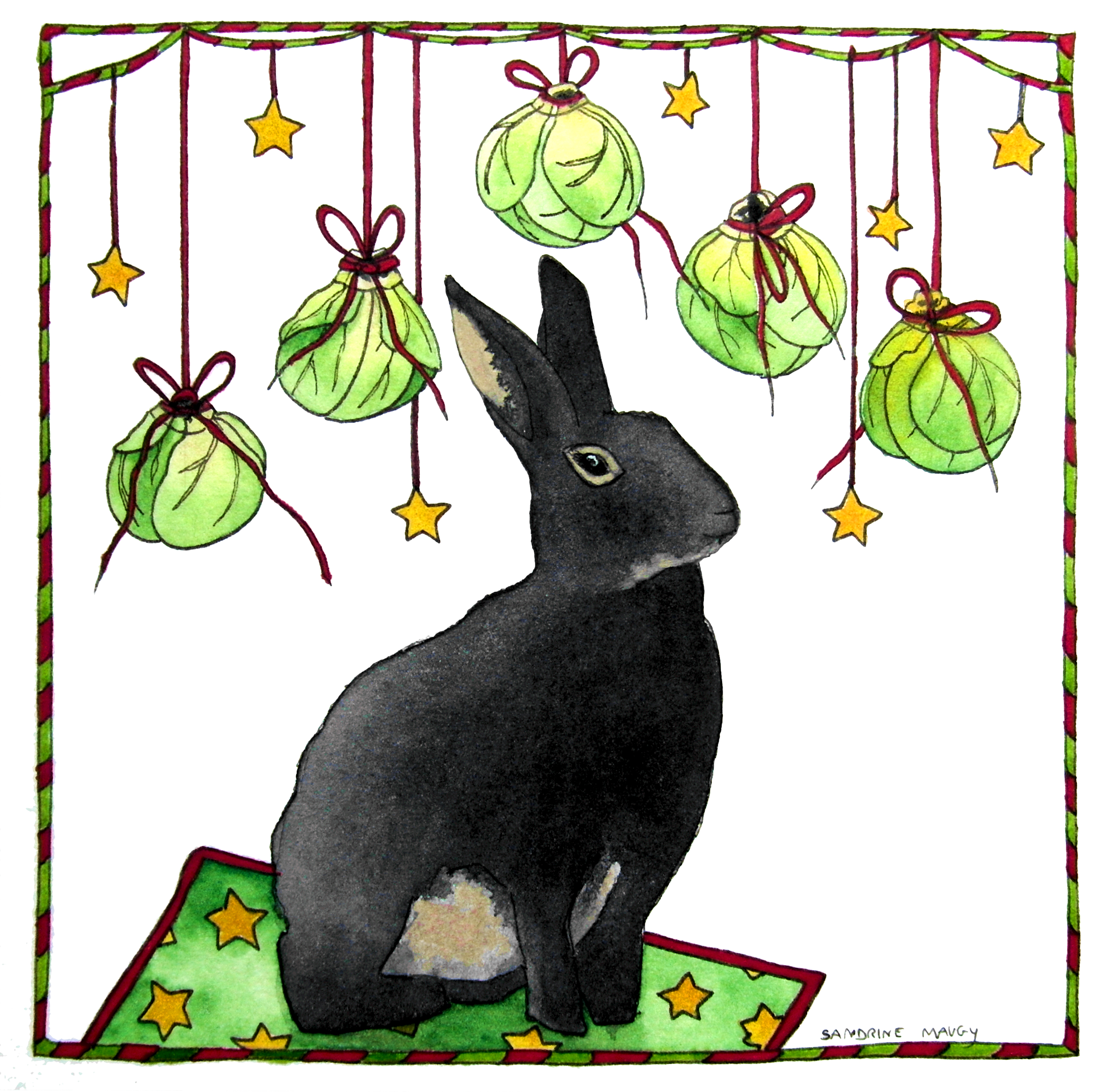
A Christmas card is meant to convey personal wishes. A personal card that means something to you and/or the receiver will be appreciated, especially compared to the mass produced banalities that circulate by the hundreds. If you have a pet, a favourite tree in your garden, or a pretty thatched cottage, include them in the design. If the receiver of the card lives in a beautiful thatched cottage, ignore those negative jealous feelings and paint an image of their gorgeous home (in the snow, with a reindeer in the front garden) for them.
Above all, have a relaxed, enjoyable time designing your cards. If it’s chilly outside, add a hot toddy to the painting process. It will help loosen up these drawing skills…
Happy painting!